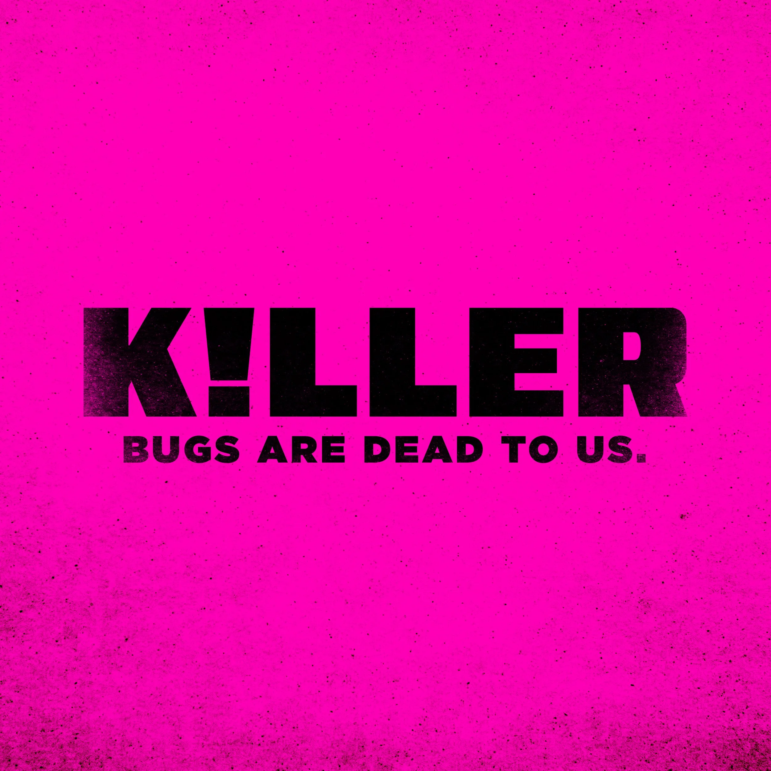
K!LLER is an edgy concept brand for flea and tick prevention, designed to stand out in a crowded pet aisle. The goal was to create packaging completely different from the traditional flea and tick category. The name itself is aggressive and bold, while the visual design draws inspiration from the more aggressive bug spray and pest-killing industries.
The Goal: To explore a concept that could disrupt the flea and tick category by taking risks with branding, color, typography, and iconography. The packaging was designed to pop on shelf, feel aggressive and loud, and immediately grab consumer attention, while still clearly communicating product details.
The Approach: Each SKU has a distinct color to clearly indicate size and species while maintaining a cohesive visual system. The concept was intended to spark conversation and explore how far a brand could stretch in terms of attitude and shelf impact.
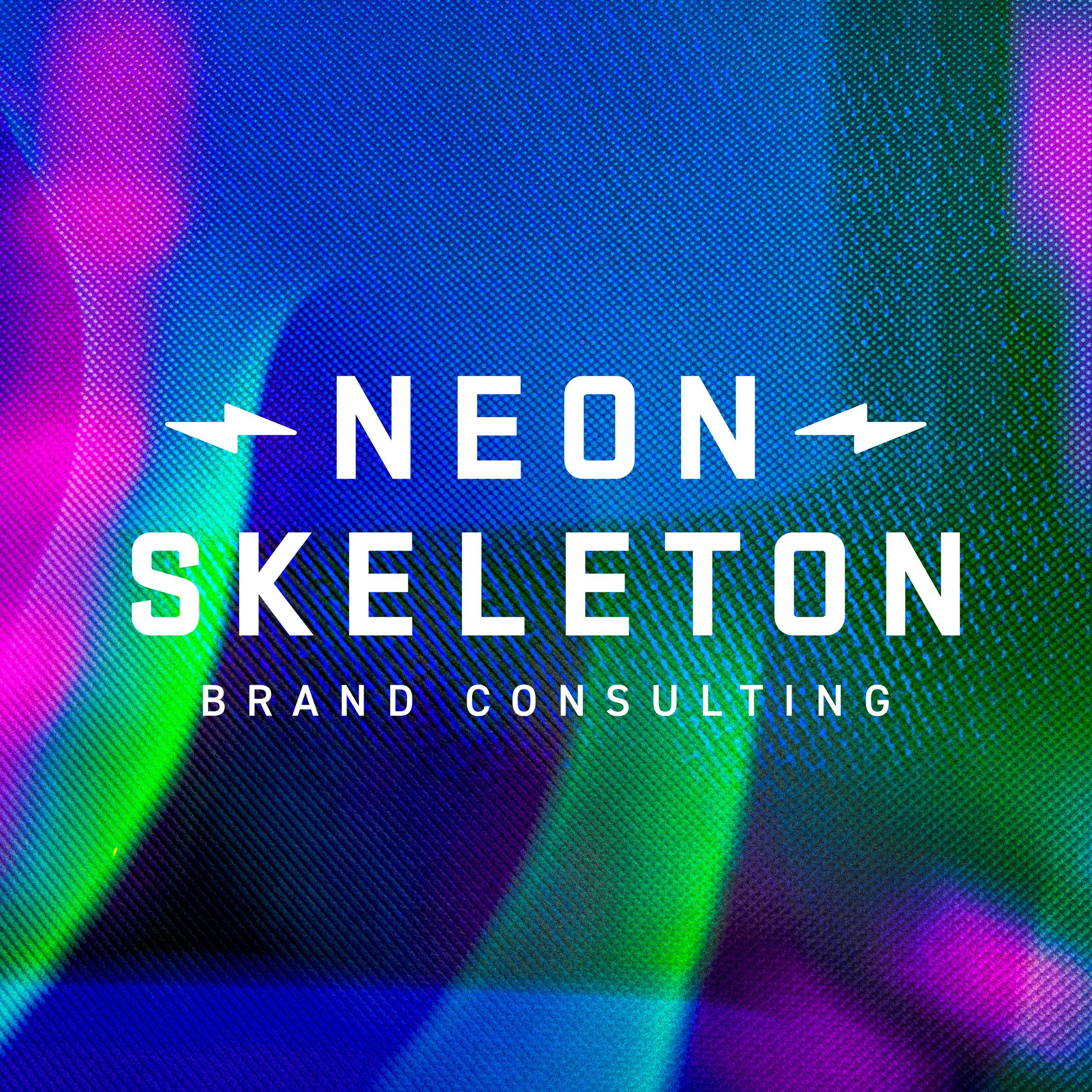
Neon Skeleton is a brand consulting side project created to explore how far a bold, opinionated identity could be pushed when freed from client constraints. My friend Jay Valle and I created all assets including the logo, iconography, custom textures, color systems, website design, copy, and more.
This project gives us the opportunity to experiment with brand voice, visual systems, and cohesive storytelling across all digital touchpoints, while targeting brands that want to be differentiated and stand out.
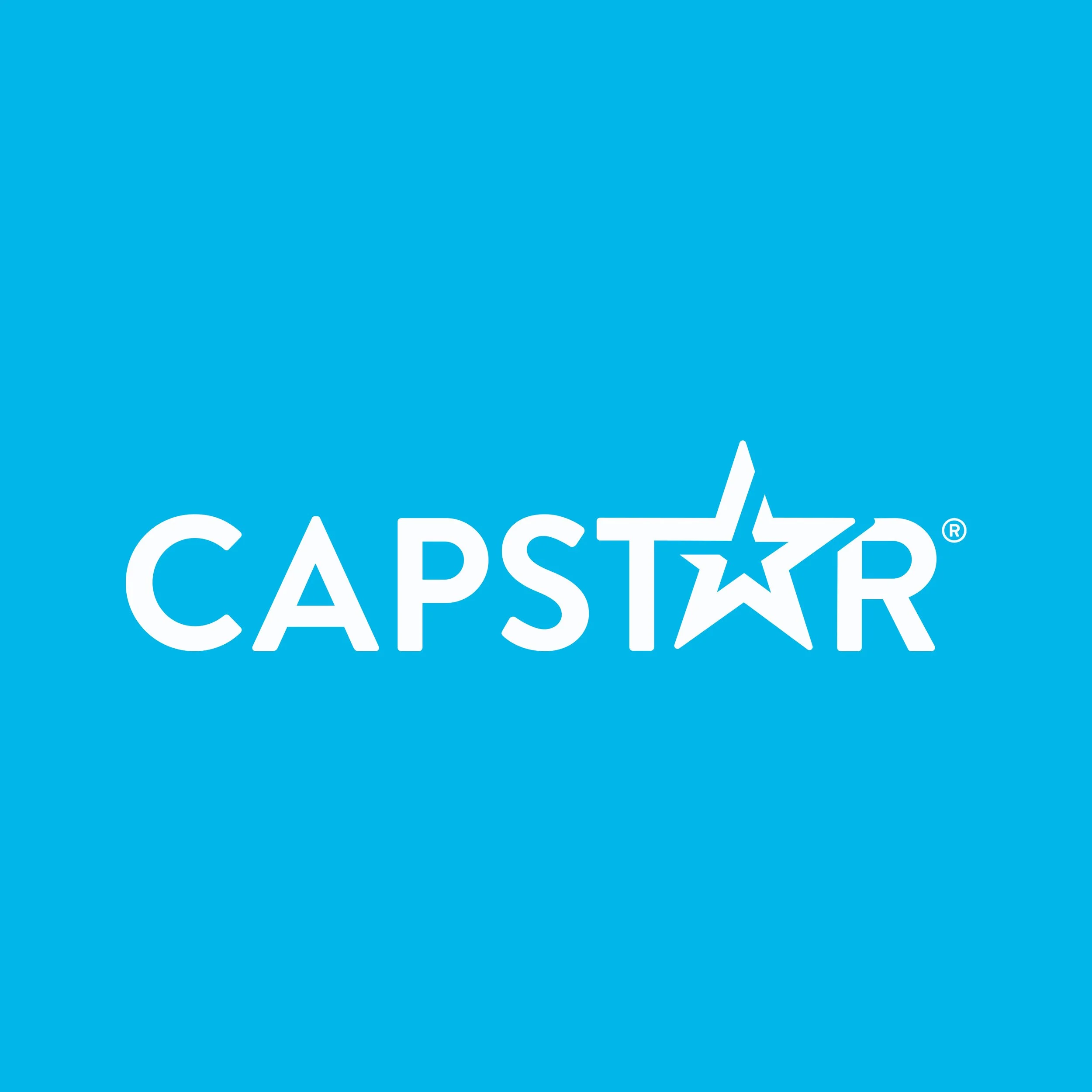
Capstar is the #1 oral flea treatment for dogs and cats on the market. While the product leads in efficacy, the legacy packaging lacked the clarity, energy, and visual appeal needed to stand out in a highly competitive category.
The Goal: Increase committed purchase preference by 4% through a packaging refresh that improved color usage, photography, hierarchy, legibility, and overall shelf presence.
The Results: After testing with Designalytics, the refreshed packaging surpassed the 4% benchmark, improving purchase preference by 25.7% and ranking in the top 10% of brands within Designalytics’ database of over 2,500 brands. Customer feedback highlighted a more engaging, approachable design with clearer weight breaks and stronger on-shelf readability.
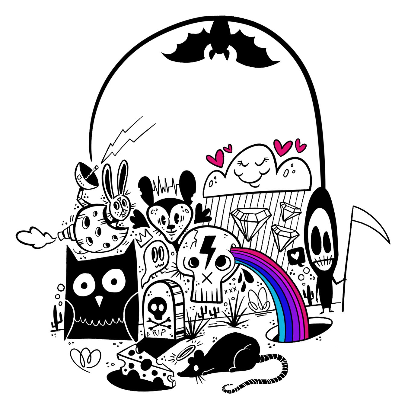
This is a collection of personal and brand-driven digital illustrations and typography exploring style, personality, and visual storytelling. These were created using ProCreate and Adobe Fresco.
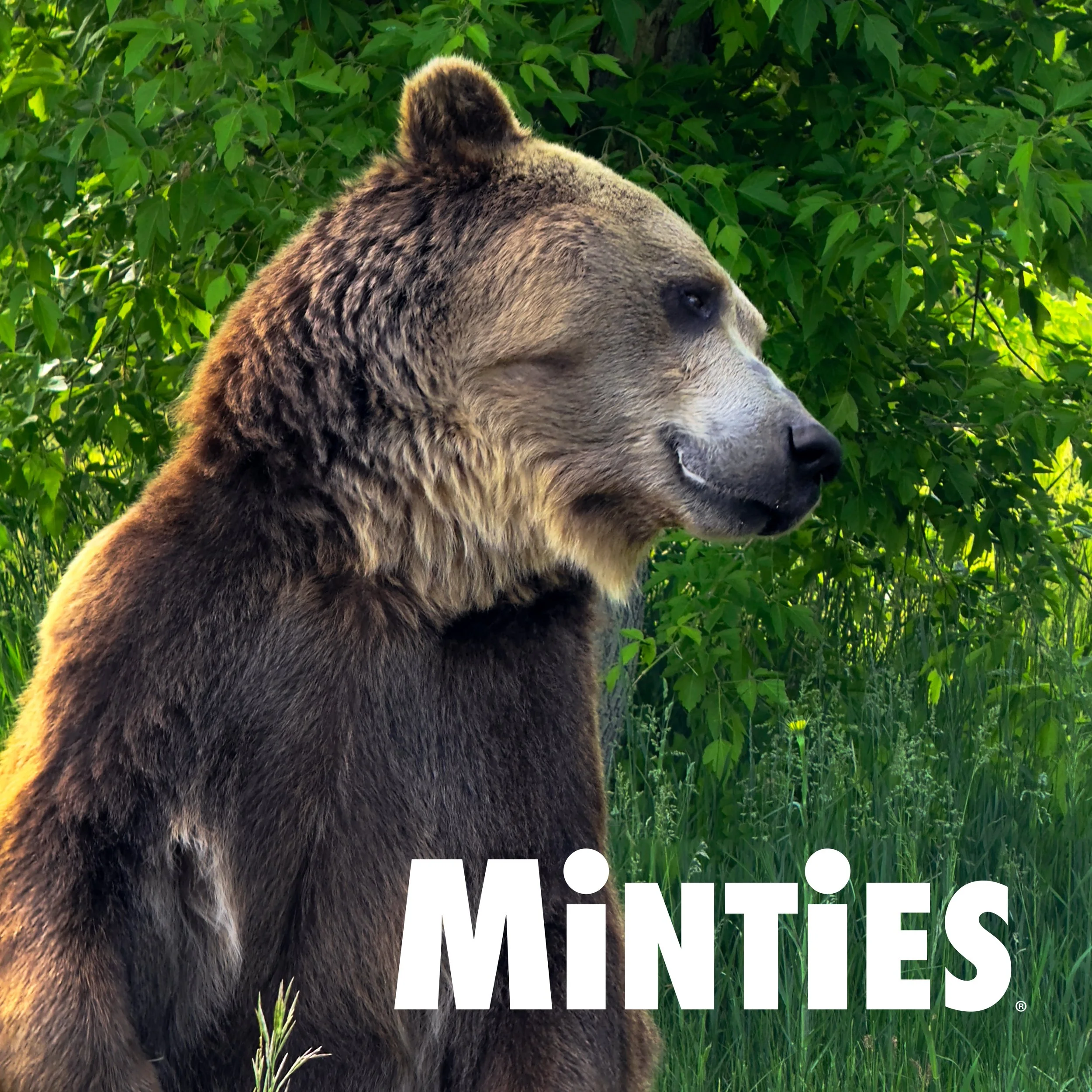
Following a Minties packaging refresh, I developed a commercial concept designed to elevate the brand’s personality through humor and unexpected storytelling. The approved script featured a live grizzly bear. This immediately raised the creative bar and excitement on the team.
Once the concept was greenlit, we moved into full production (scripting, storyboarding, casting, and location planning) which took us to Utah to film with renowned animal trainer Doug Seus, owner of Tank the Bear. The shoot required close collaboration between creative, talent, animal trainers, and safety teams.
While the final spot evolved during post-production, the project remains a defining example of ambitious brand storytelling and reinforced the value of pushing creative boundaries.
Rocco & Roxie is the #1 stain & odor remover on Amazon, with a rapidly expanding product line. As the portfolio grew, the brand needed to strengthen shelf recognition while maintaining clarity, consistency, and scalability across SKUs.
The Goal: Strengthen logo/brand presence, simplify RTBs, introduce new iconography, improve hierarchy, and to create a consistent packaging system at scale across all current and future SKUs.
The Results: After testing with Designalytics, we were excited to see we surpassed the 4% benchmark and improved purchase preference by 26.2%. This ranked in the top 10% of all brands within Designalytics database of over 2,500 brands. Customer feedback consistently validated the design, reinforcing stronger brand recognition, clearer hierarchy, and improved shopability.
Music has always been a major creative influence in my work. Early on, I began collaborating directly with bands to design posters that promoted shows while giving me freedom to experiment visually.
The posters were created using a mix of analog and digital techniques, including ink on paper, hand-drawn typography, photography, collage, and digital production in Photoshop and Illustrator. Most pieces were designed for social distribution, with select posters printed for physical promotion.
Pur Luv is the #1 selling dog jerky treat on Amazon. While the product leads in popularity, the legacy packaging featured a small, complicated logo and inconsistent branding that made it difficult to stand out online or convey the playful, lovable personality of the brand.
The Goal: Refresh the packaging to strengthen brand identity without alienating existing customers. Key objectives included redesigning the logo (removing “Live. Love. Treat.”), refining colors and overall vibe, introducing a distinctive illustration that leveraged the Pur Luv name, and keeping the clear bag silhouette so the product remained visible.
The Results: The updated packaging was very well received, with feedback highlighting the stronger, more playful brand presence, improved clarity, and unique visual appeal. The new logo, color palette, and illustration system successfully convey the brand’s personality while maintaining recognition for existing customers.
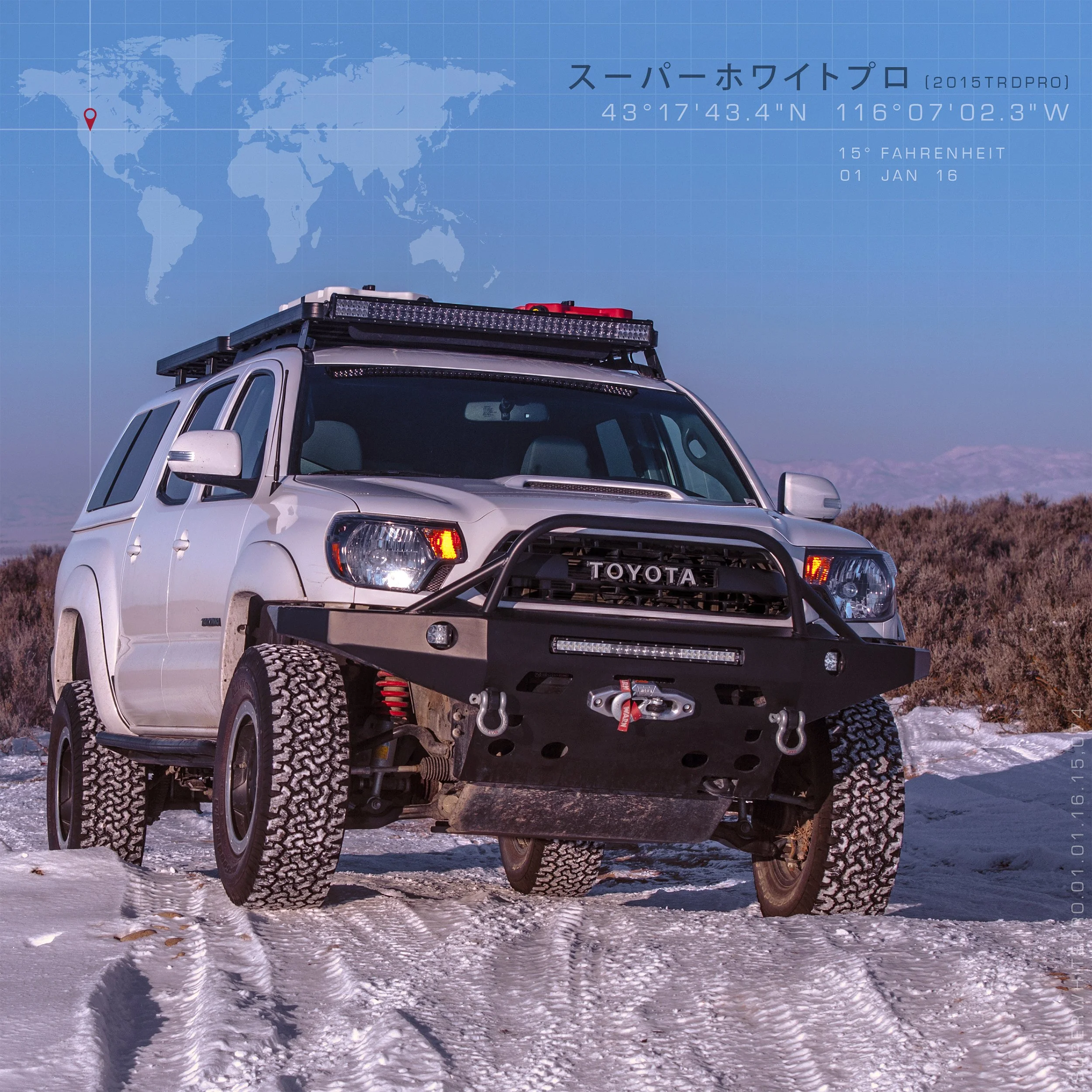
After purchasing a Toyota Tacoma TRD Pro, I launched an Instagram account to document my outdoor adventures. The account quickly gained over 23,000 followers, leading to collaborations with outdoor and off-road brands, including Yeti, Cotopaxi, Camp Chef, and Front Runner, to promote their products through photography and content creation.
This project combines many of my favorite disciplines, from photography and design to marketing, networking, travel, and adventure.
See more at instagram.com/superwhitepro
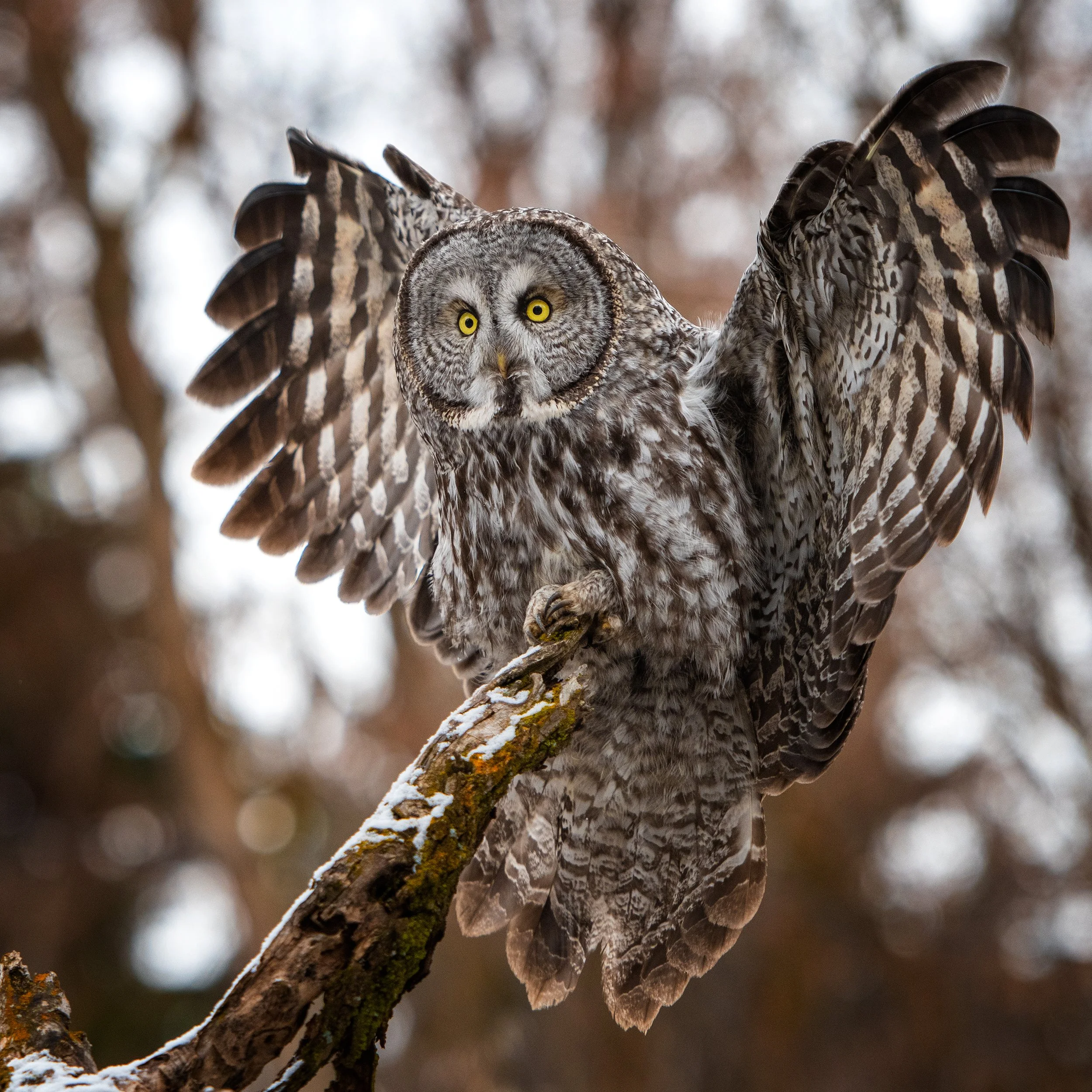
I’m a bird nerd at heart, especially when it comes to raptors. Over the years, photographing owls, hawks, eagles, and falcons has become one of my favorite outdoor hobbies. Whether I’m traveling, camping, or exploring my own backyard, I’m constantly on the lookout for the next bird of prey to capture.
These photos were all taken with my trusted Nikon D500 and 70–200mm lens, combining patience, luck, and technical skill to showcase the beauty of the natural world.
I’ve always loved both live music and photography, so concert photography became a natural way to combine the two. I started reaching out to bands and their management to secure photo passes at local venues, which gave me the opportunity to capture the energy of live performances up close.
Over time, I’ve photographed bands like 311, Chevelle, 10 Years, and members of The Mars Volta, using a Nikon and a variety of lenses to adapt to each venue and its lighting.
Many of these photos were used for social media, promotional materials, and tour promotion.
This self-initiated campaign was created to showcase my illustration style and build visibility on social platforms.
Each illustration was created using ink on paper, with color and finishing added digitally in Photoshop. The project allowed for creative experimentation while reinforcing a consistent visual voice across the series.
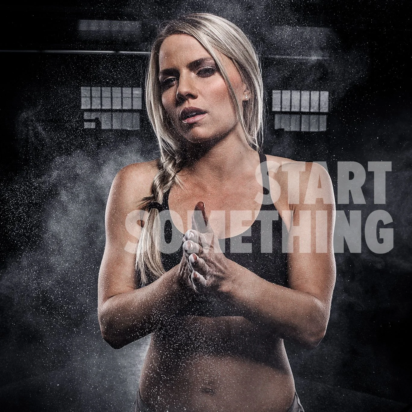
This was the second print advertising campaign I designed for Bodybuilding.com, developed to create high-impact, attention-grabbing visuals that resonate with fitness enthusiasts.
I was involved throughout the entire process, including planning and organizing the photo shoot, coordinating with photographers and models, art direction on set, photo editing, and copy layout.
The final ads ran across multiple national publications, including Men’s Fitness, Men’s Health, Oxygen, and Shape.
This campaign received a Gold Rockies Award from the Boise Ad Federation.
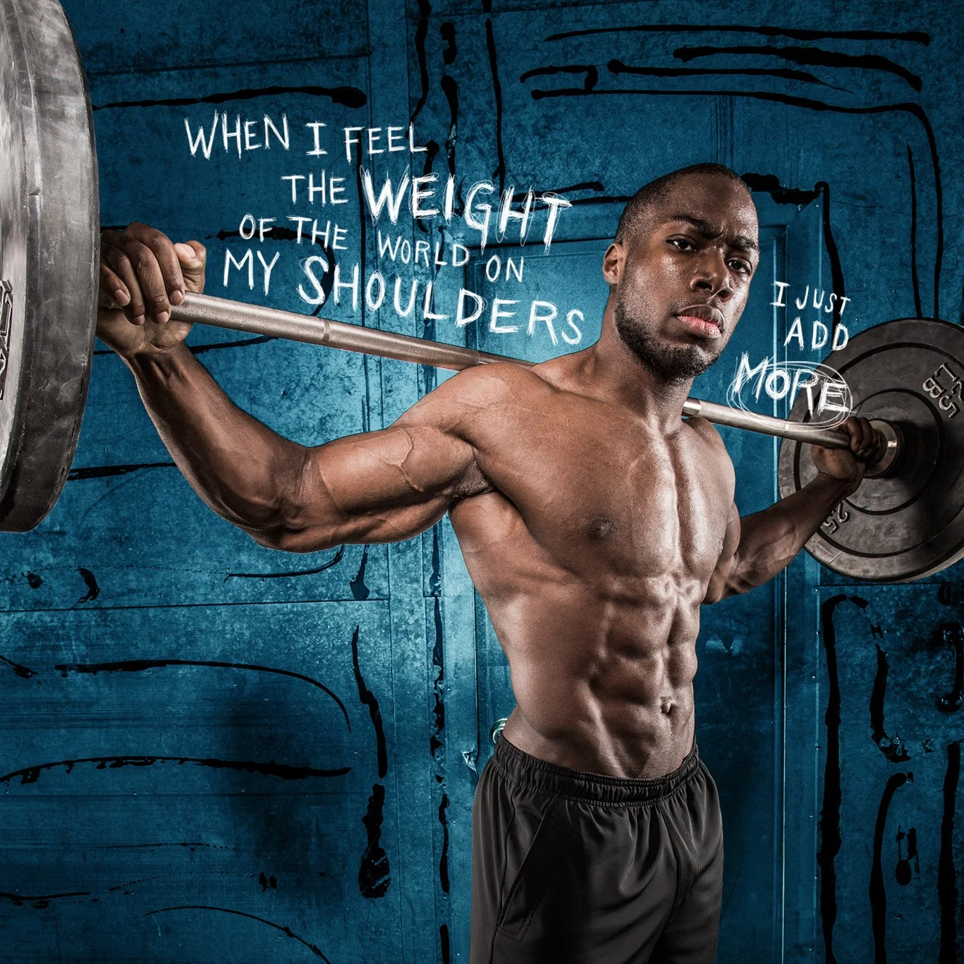
This was my first major project at Bodybuilding.com, where I led the creation of the annual print advertising campaign. I oversaw all aspects of production, including organizing and directing photoshoots with athletes, editing images, designing hand-drawn typography, and coordinating with publications.
These ads ran in national and international health and fitness publications, including Men’s Health, Men’s Fitness, ESPN Magazine, Runner’s World, Oxygen, and Shape.
This campaign received a Gold Rockies Award from the Boise Ad Federation.
This campaign was created to celebrate October 21, 2015, the date Marty McFly and Doc Brown went to the future in the 1989 film 'Back to the Future II'.
The marketing team and I wanted to celebrate this epic day by creating an entire campaign using imagery and iconic objects from the movie. After brainstorming (and watching the movie a few times) we found ways to incorporate the DeLorean, flux capacitor, hover board, clocktower, and the disappearing photograph into the creative.
This project included creating a vector logo, photographing a model (as Marty), lots of Photoshop, and creating animated GIFs.
Halloween has always been my favorite holiday, making Monster Deals at Bodybuilding.com an especially fun campaign to work on. I used Photoshop to transform Bodybuilding.com athletes into ghosts and zombies, creating bold, playful visuals tied to the seasonal promotion.
The campaign ran primarily across email, with supporting social and digital placements.
This project explores surreal, cinematic landscapes with an eerie, otherworldly tone. The three images are tied together as a series through shared visual elements (consistent horizon lines, sea life, and subtle human presence) creating a cohesive visual narrative.
These works demonstrate experimentation with composition and mood, using Photoshop as a tool to build atmosphere and continuity across the series.
A few friends and I developed a playful concept for a fictional supplement brand: Bear Maximum! Each product in the line represented testosterone sourced from a different type of bear… polar bears, grizzlies, and pandas.
The concept was designed as an exploration in branding, packaging, and humor-driven storytelling. It allowed us to experiment with product differentiation, visual identity, and tone of voice in a way that was intentionally absurd, memorable, and attention-grabbing.
Though the brand was never produced, it remains a fun example of conceptual design and creative risk-taking that balances humor, visual identity, and narrative.